iab
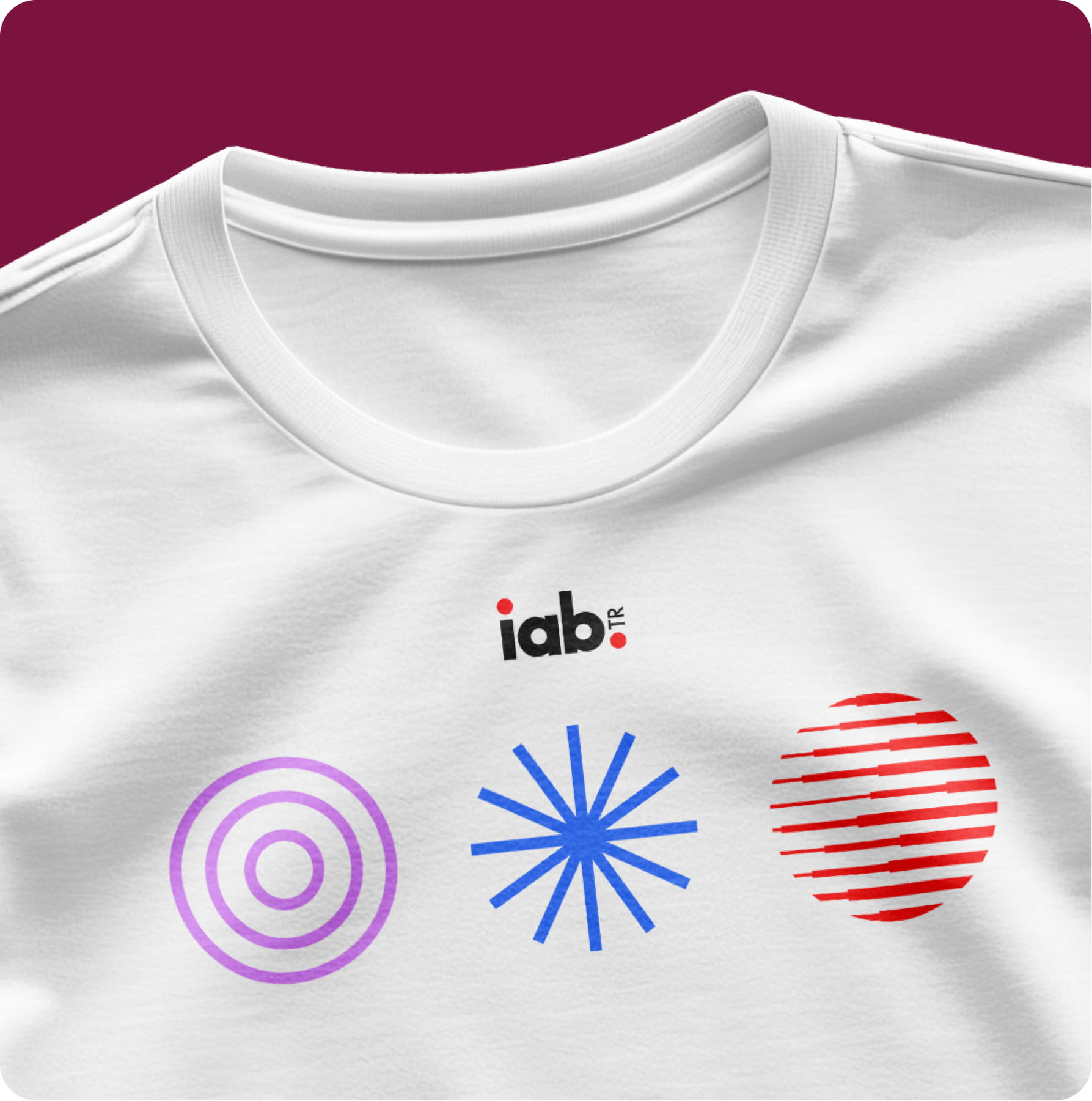
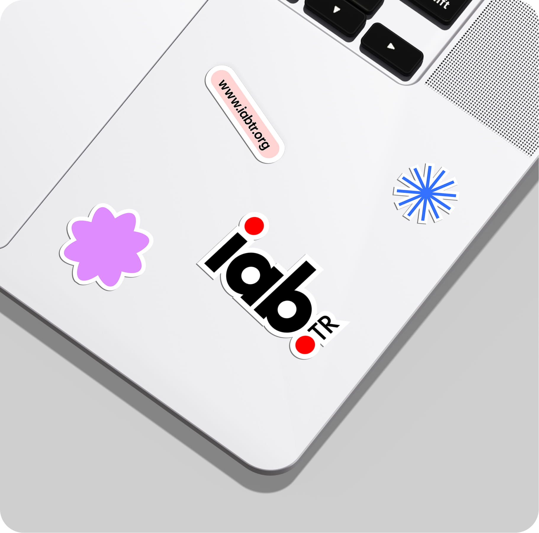
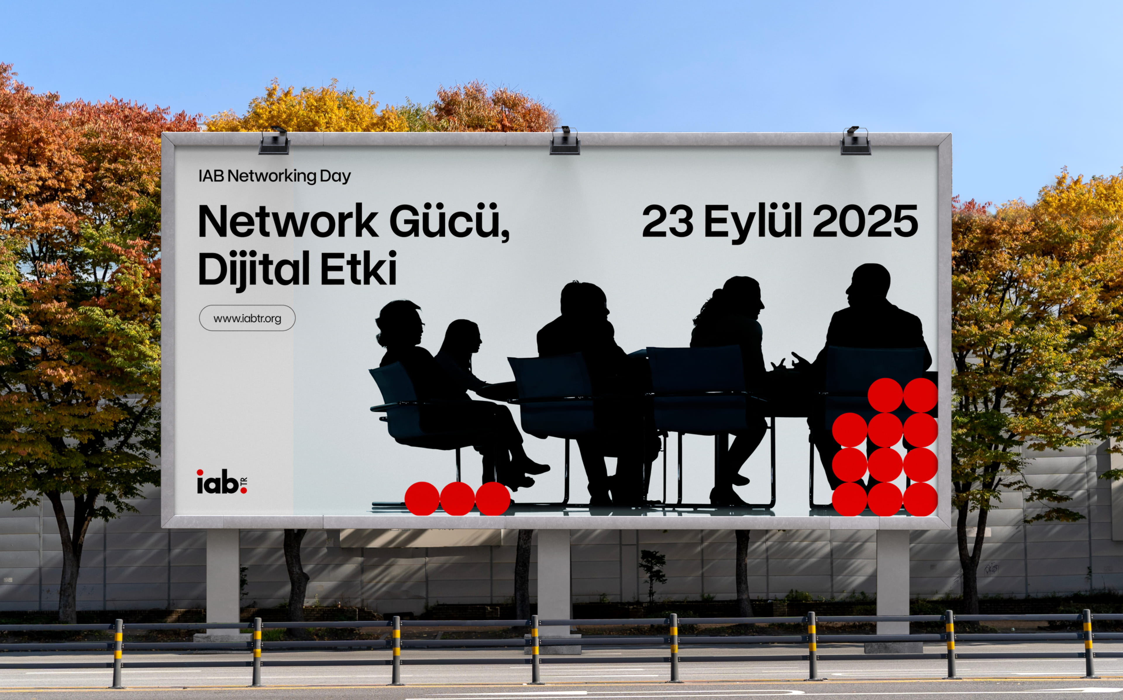
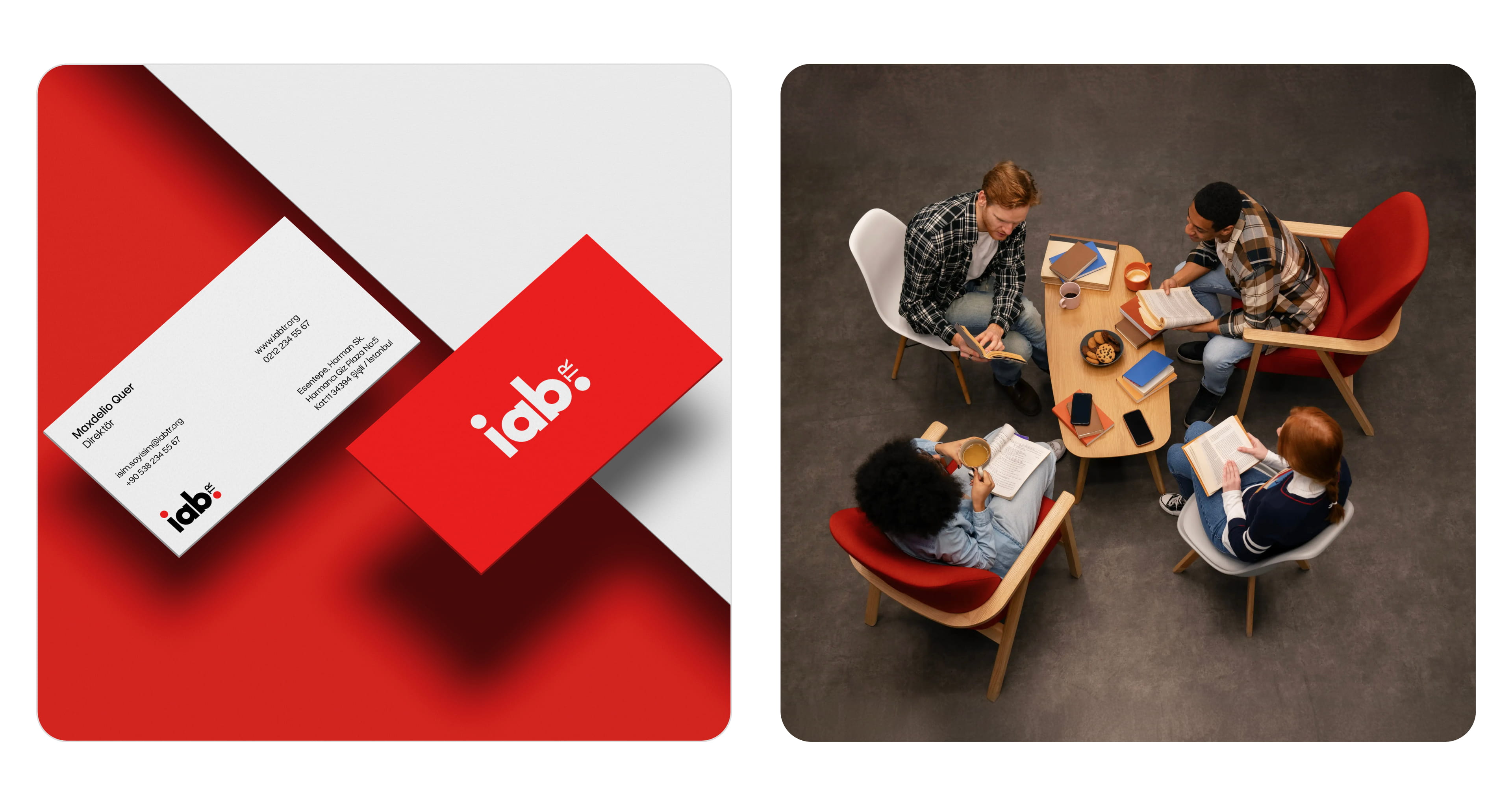
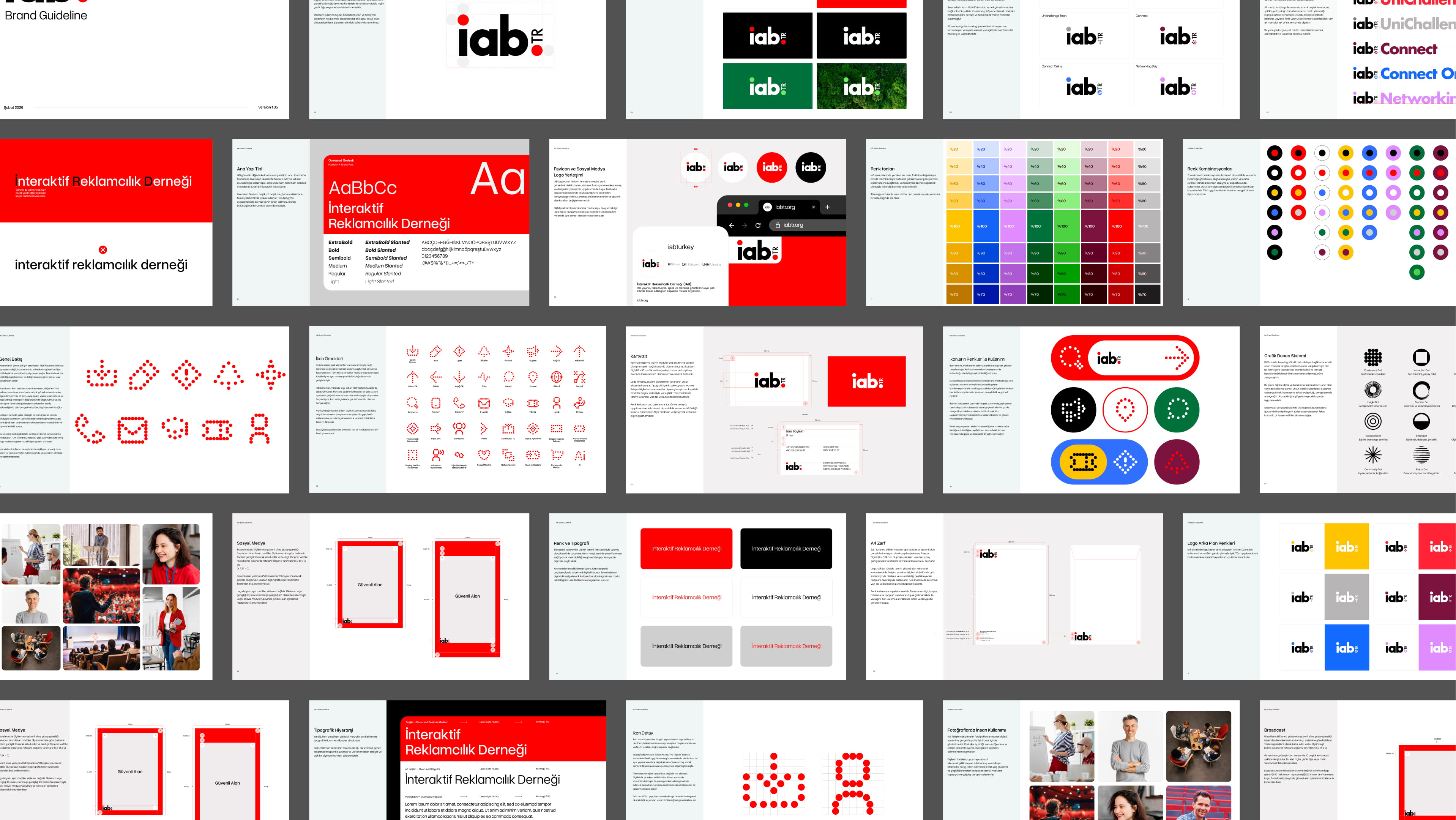
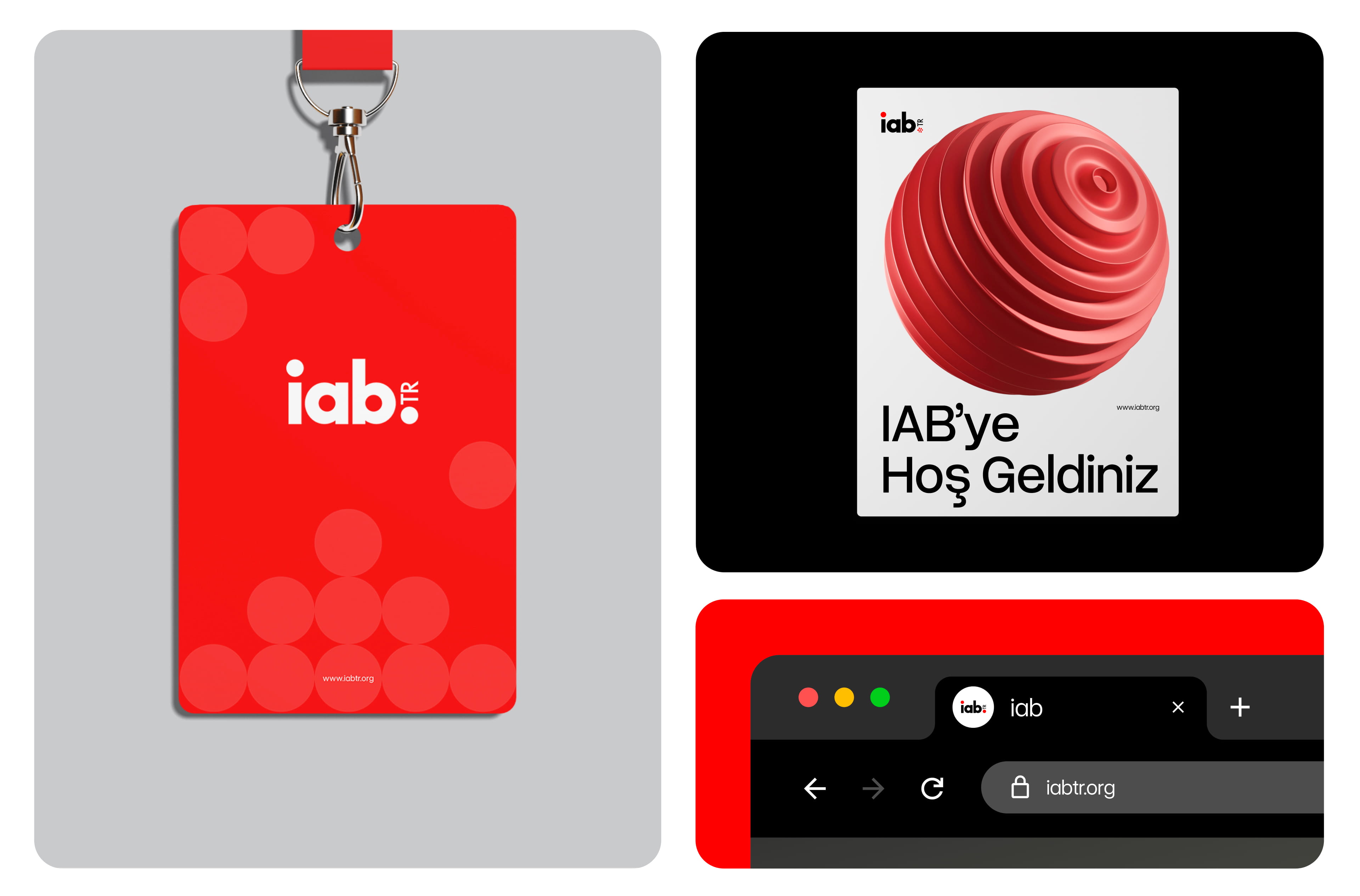
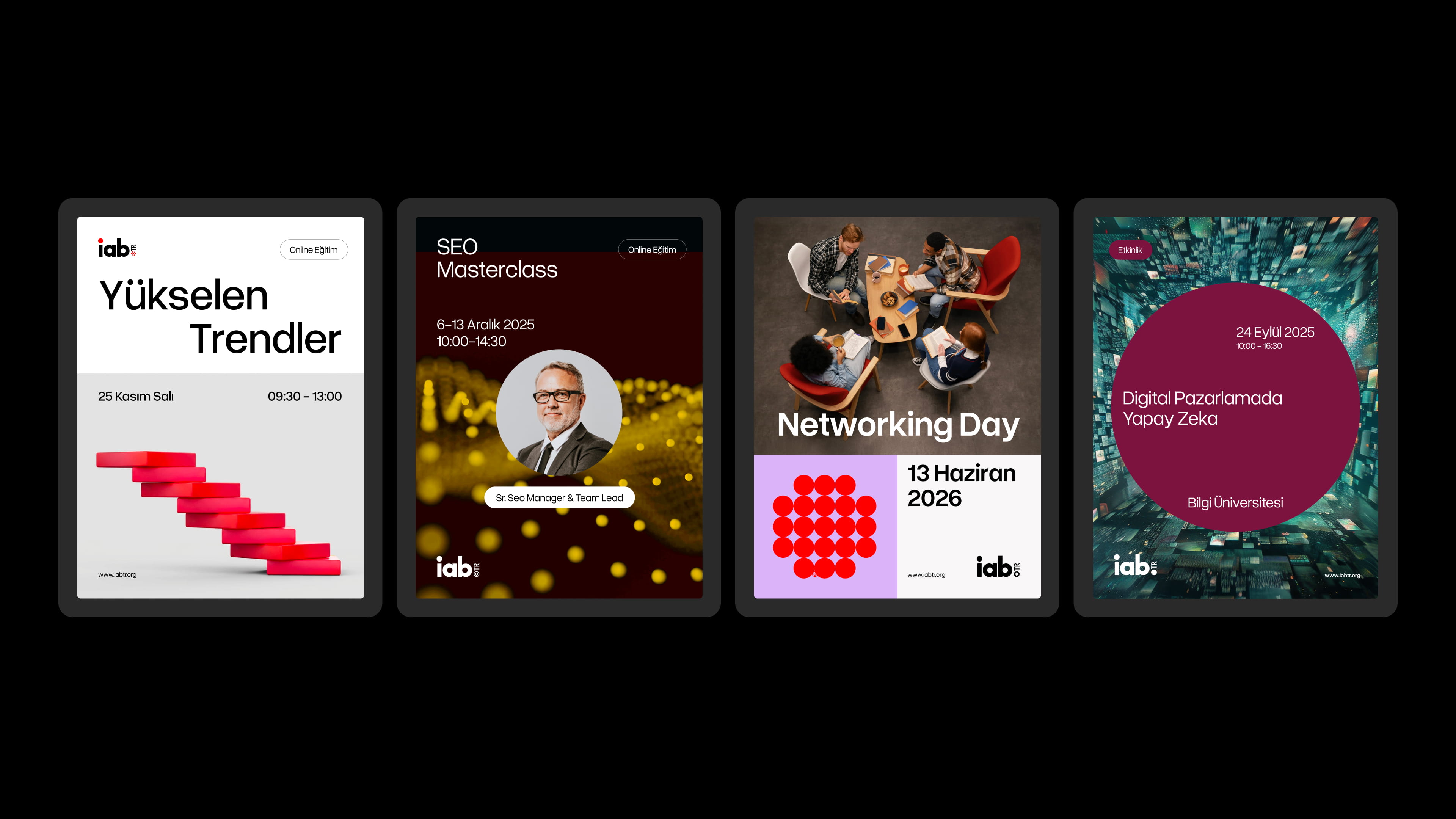
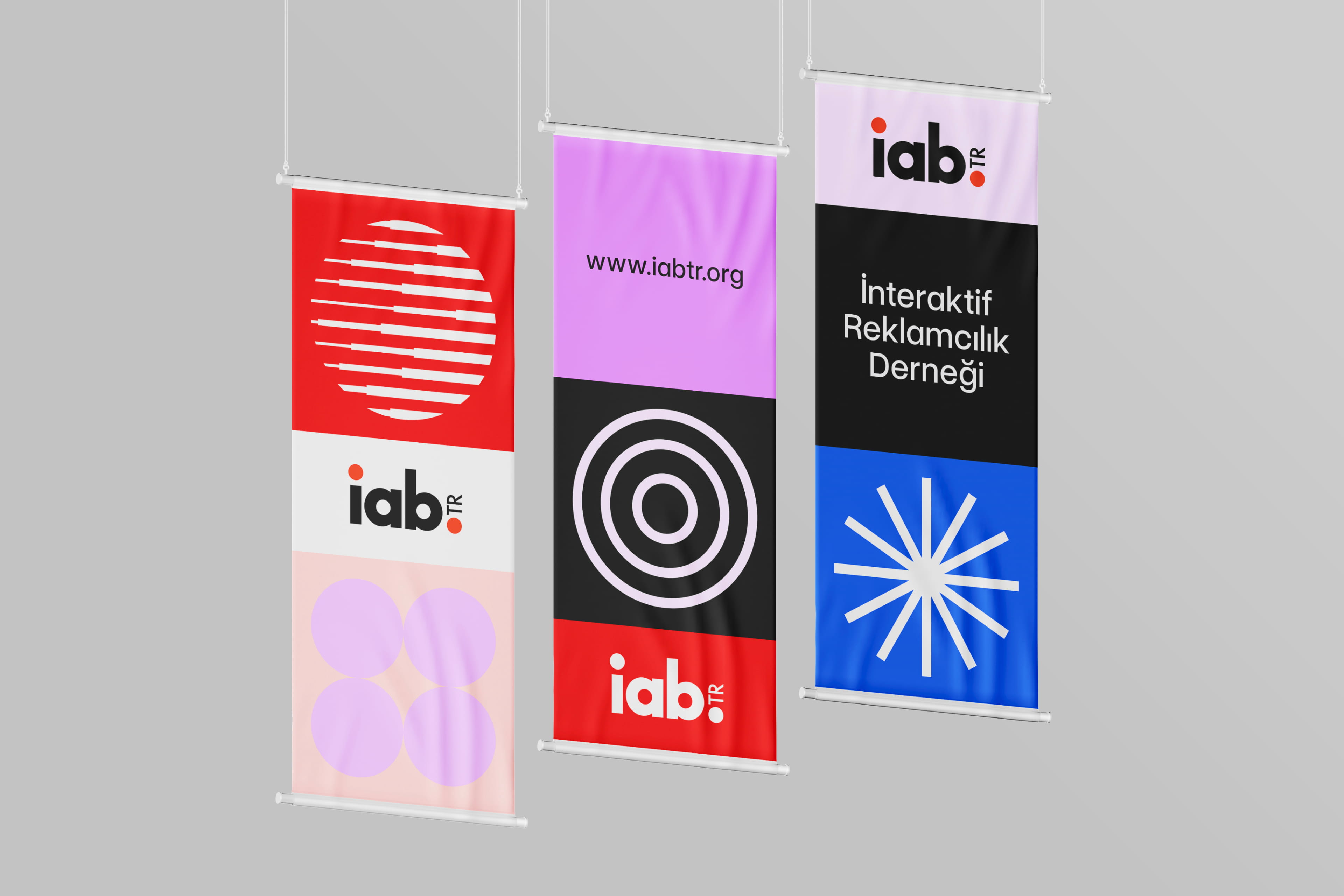
In the redesign of IAB Turkey’s brand identity, we built a visual universe that draws its strength from the brand’s roots. We transformed the iconic “dots” at the center of the logo into a new visual language.
We took these dots—which represent “connection points” linking data and communities, much like the pixel, the smallest unit of the digital world—and transformed them from static elements into a modular visual system that is dynamic, flexible, and constantly interacting. The dots came together, and IAB Turkey’s new visual universe was born.