Rheinalt
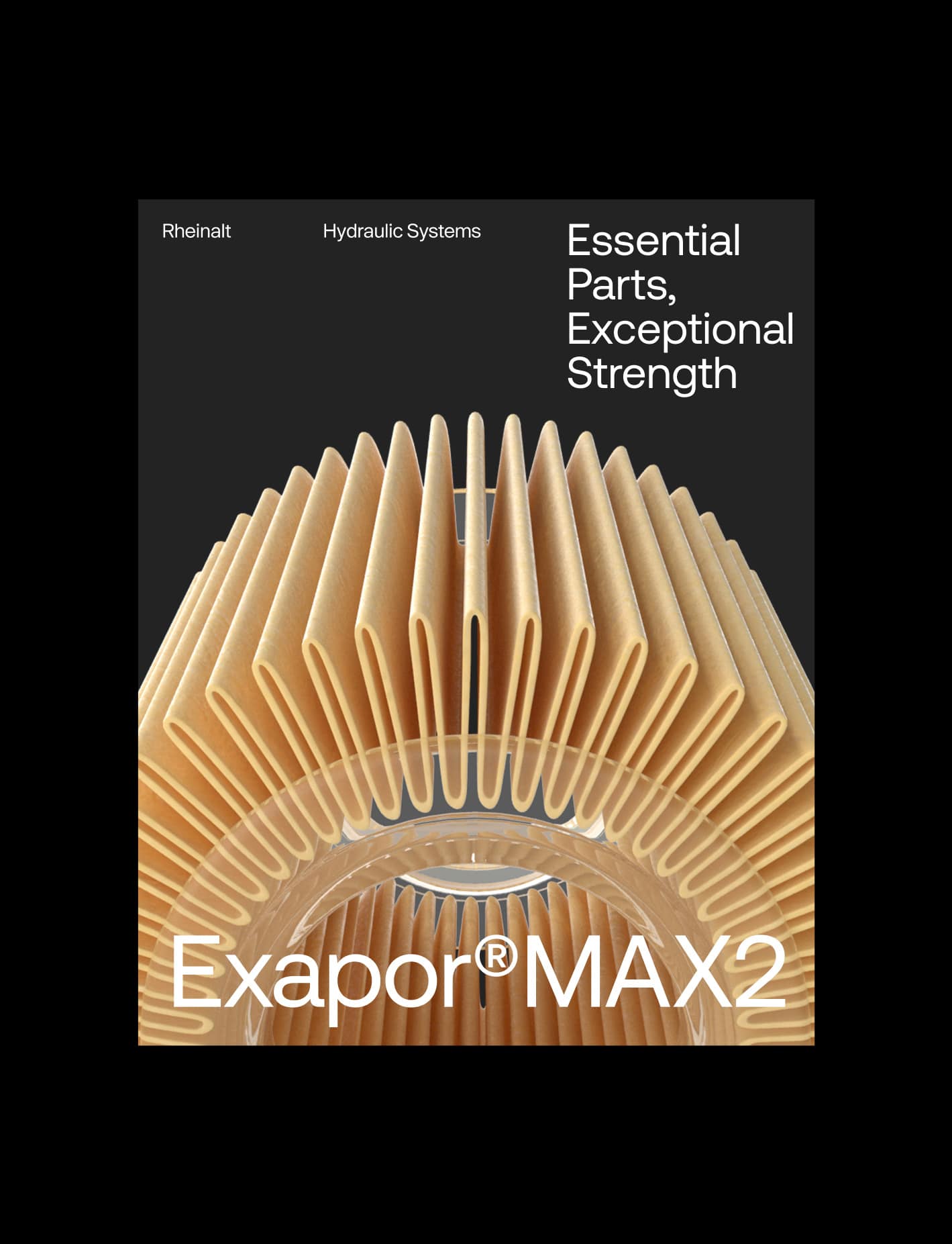
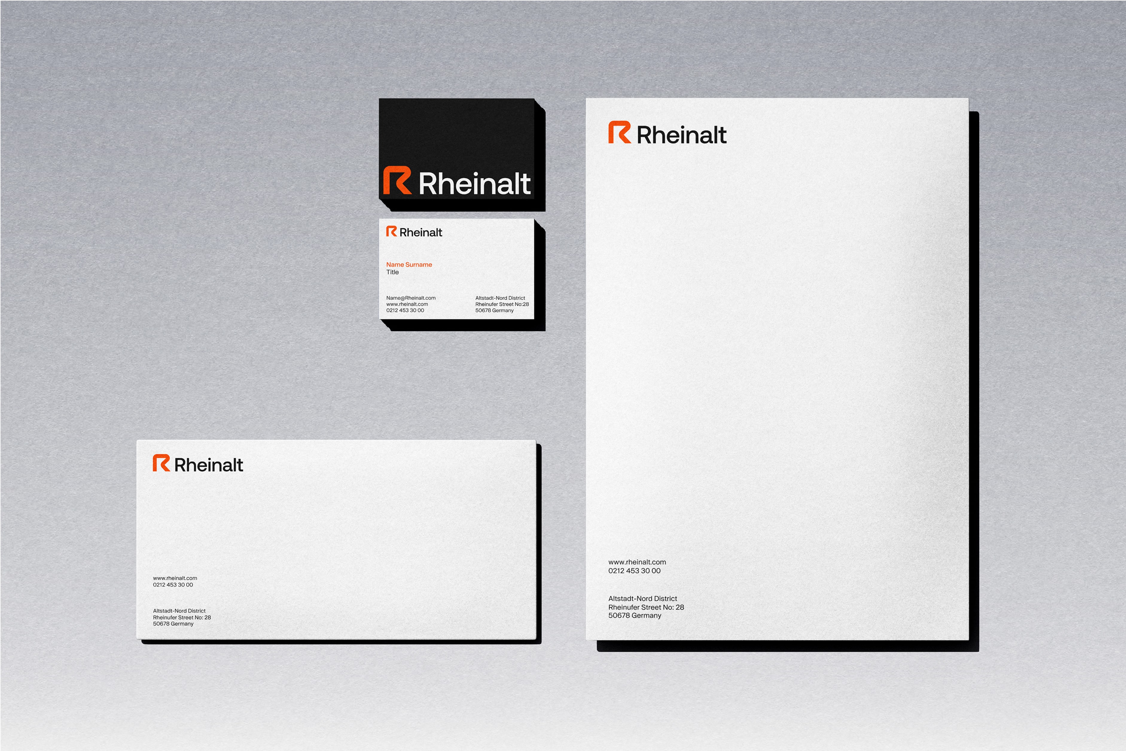
Rheinalt is an engineering-driven brand positioned within the field of hydraulic systems and industrial solutions. The visual identity we developed reflects Rheinalt’s technical expertise and forward-looking vision through a refined, bold, and enduring design system.
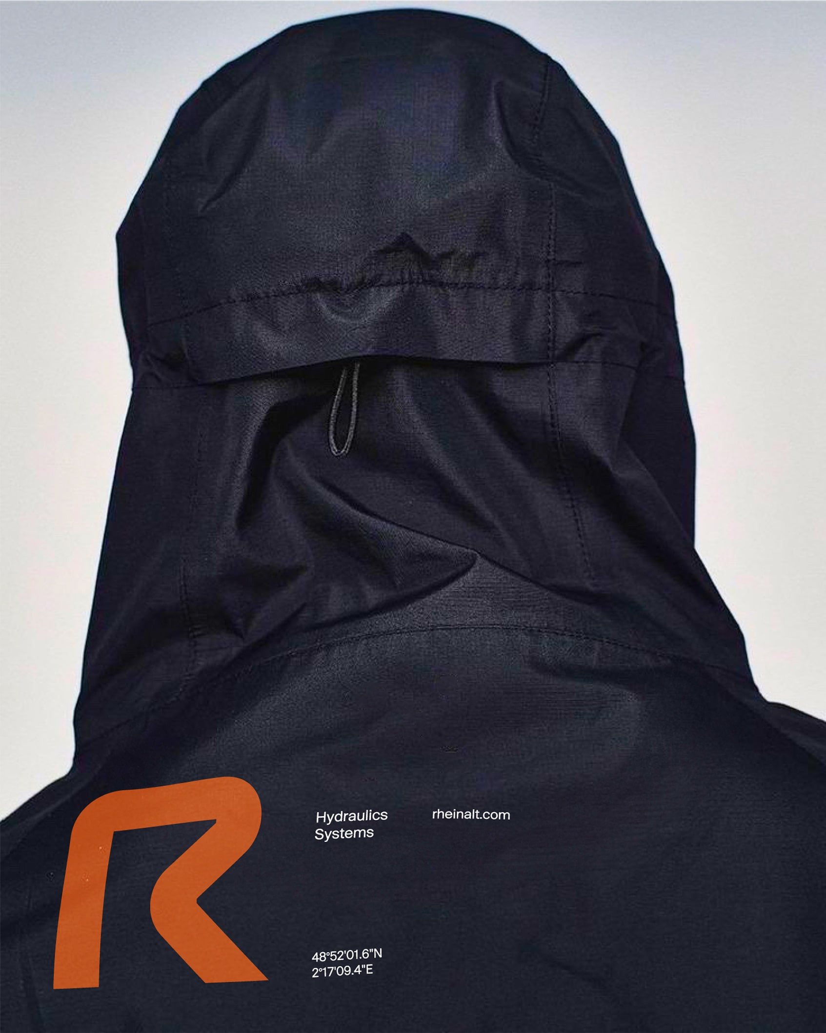
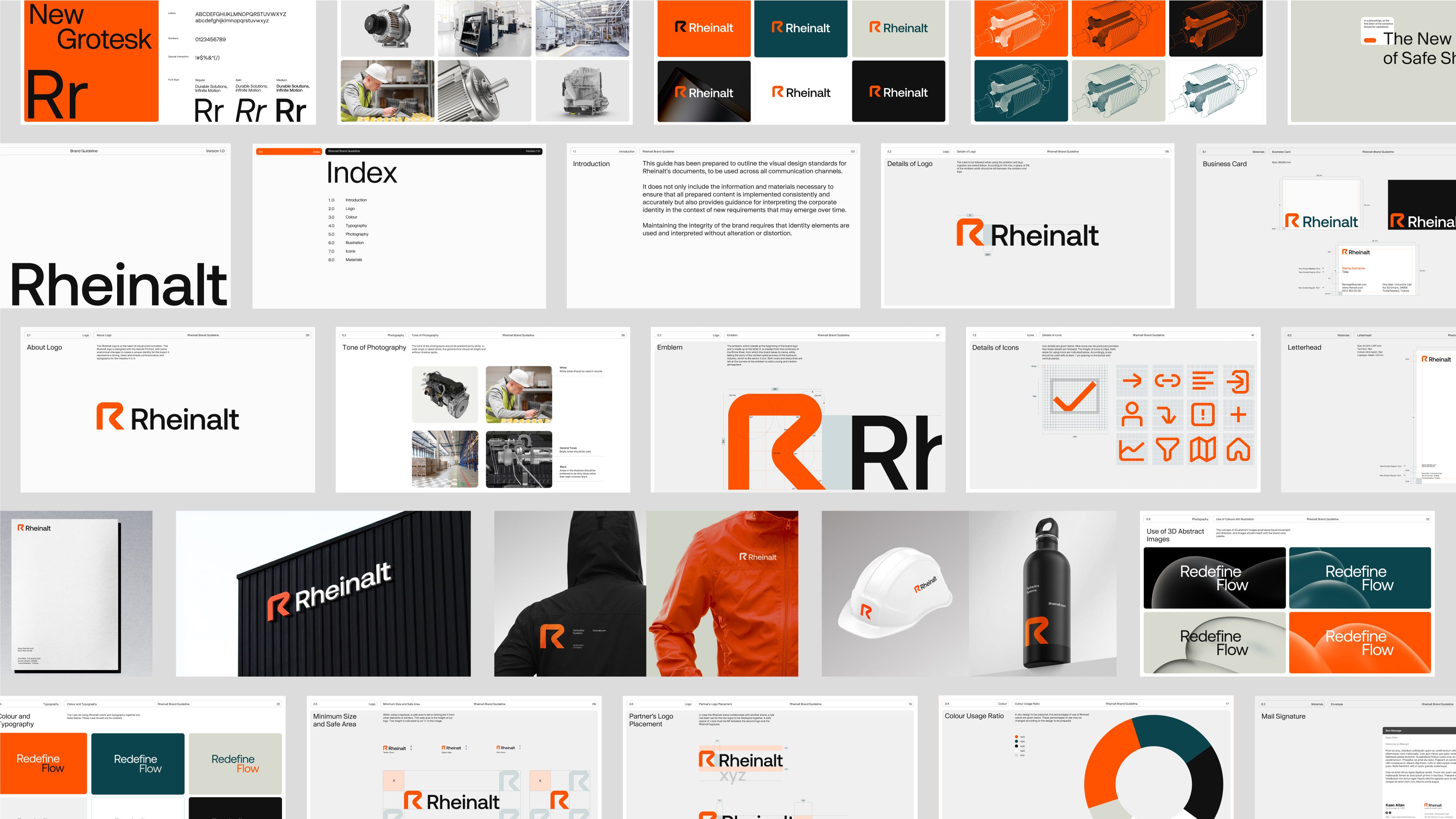
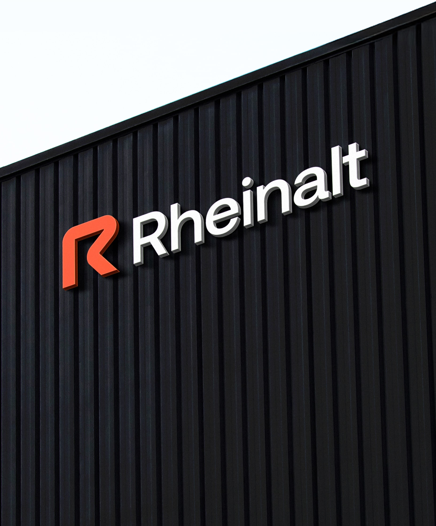
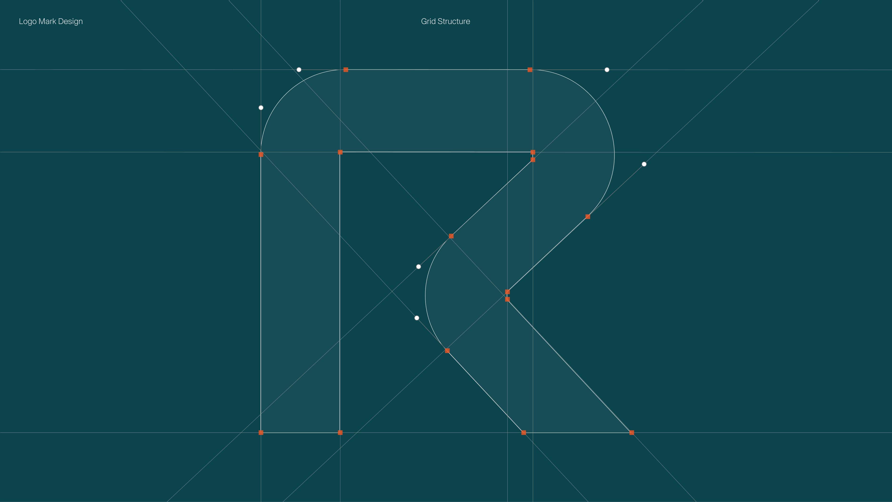
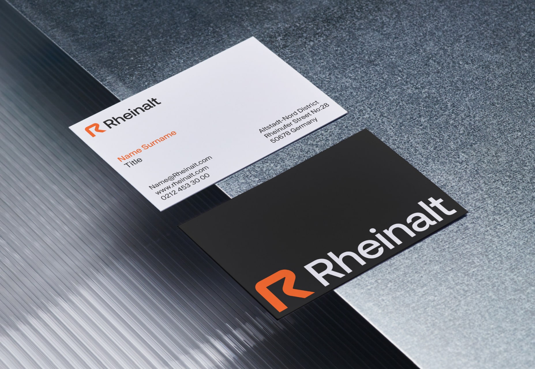
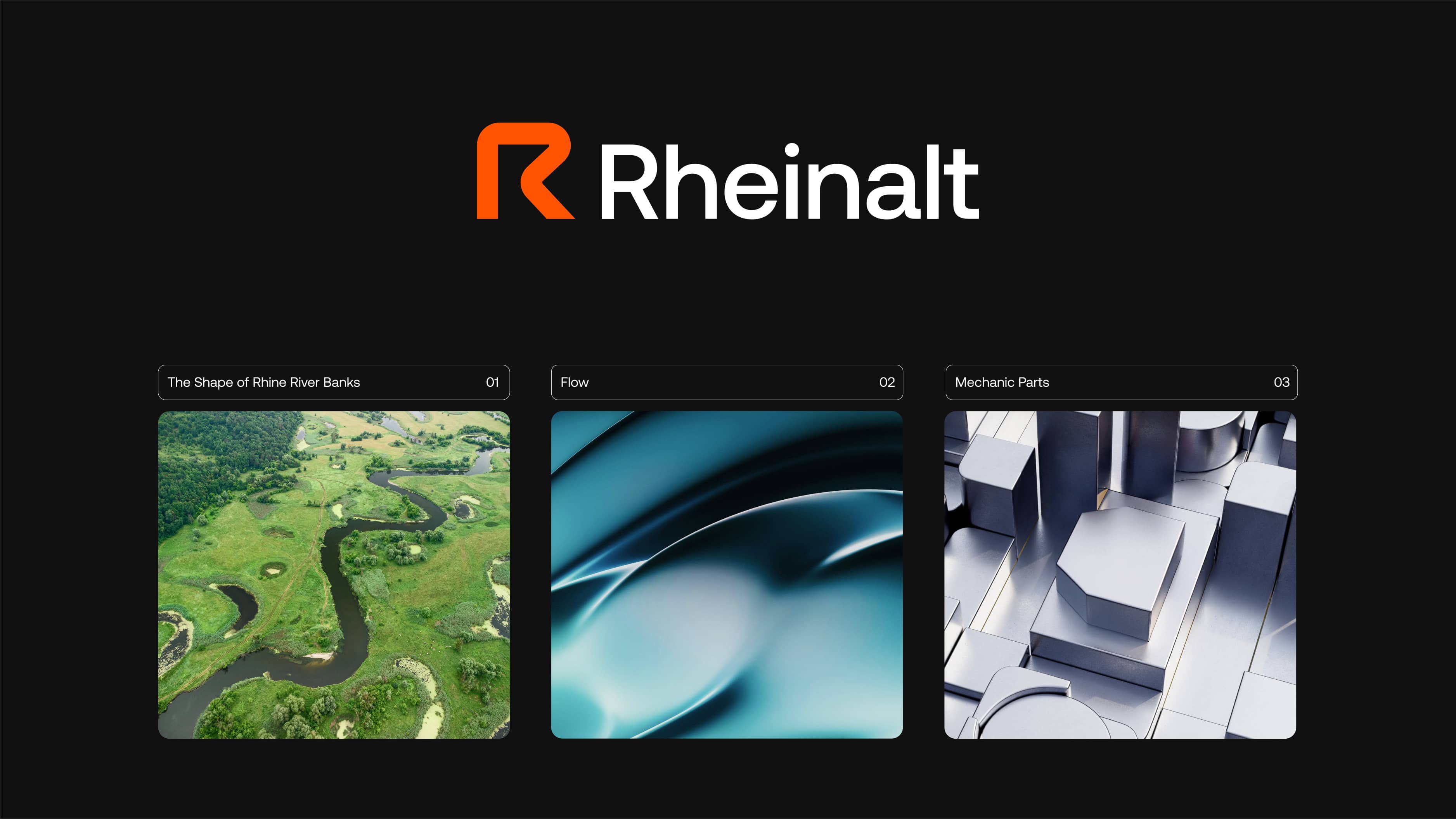
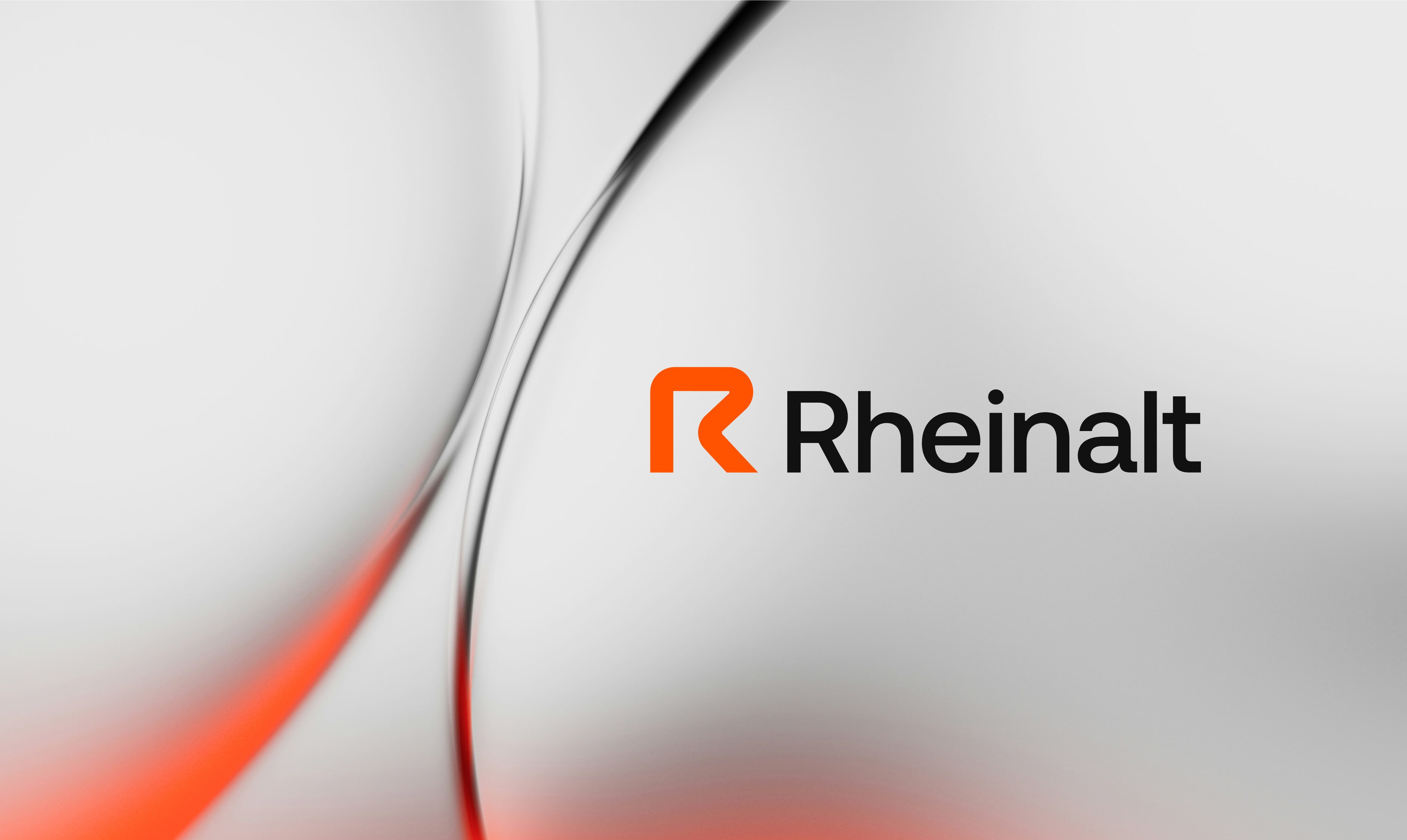
At the heart of the logo lies a curved “R” form; its fluid structure conveys a sense of movement and continuity, while its geometric precision alludes to engineering discipline. The dynamic sense of fluidity influences the brand’s visual, typography, and layout designs both in form and feeling. This sense of flow subtly references the geographical origin behind the brand’s name.
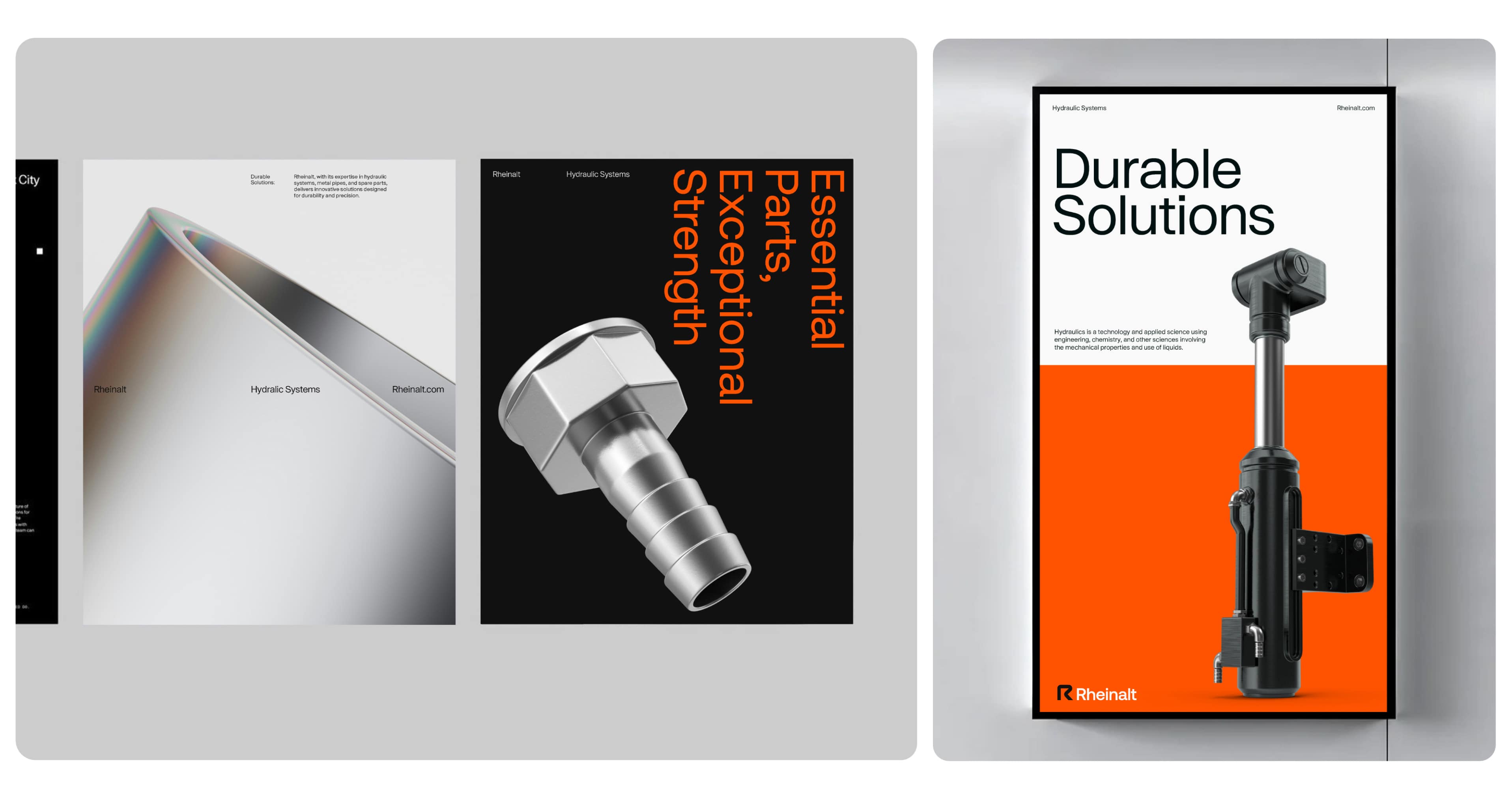
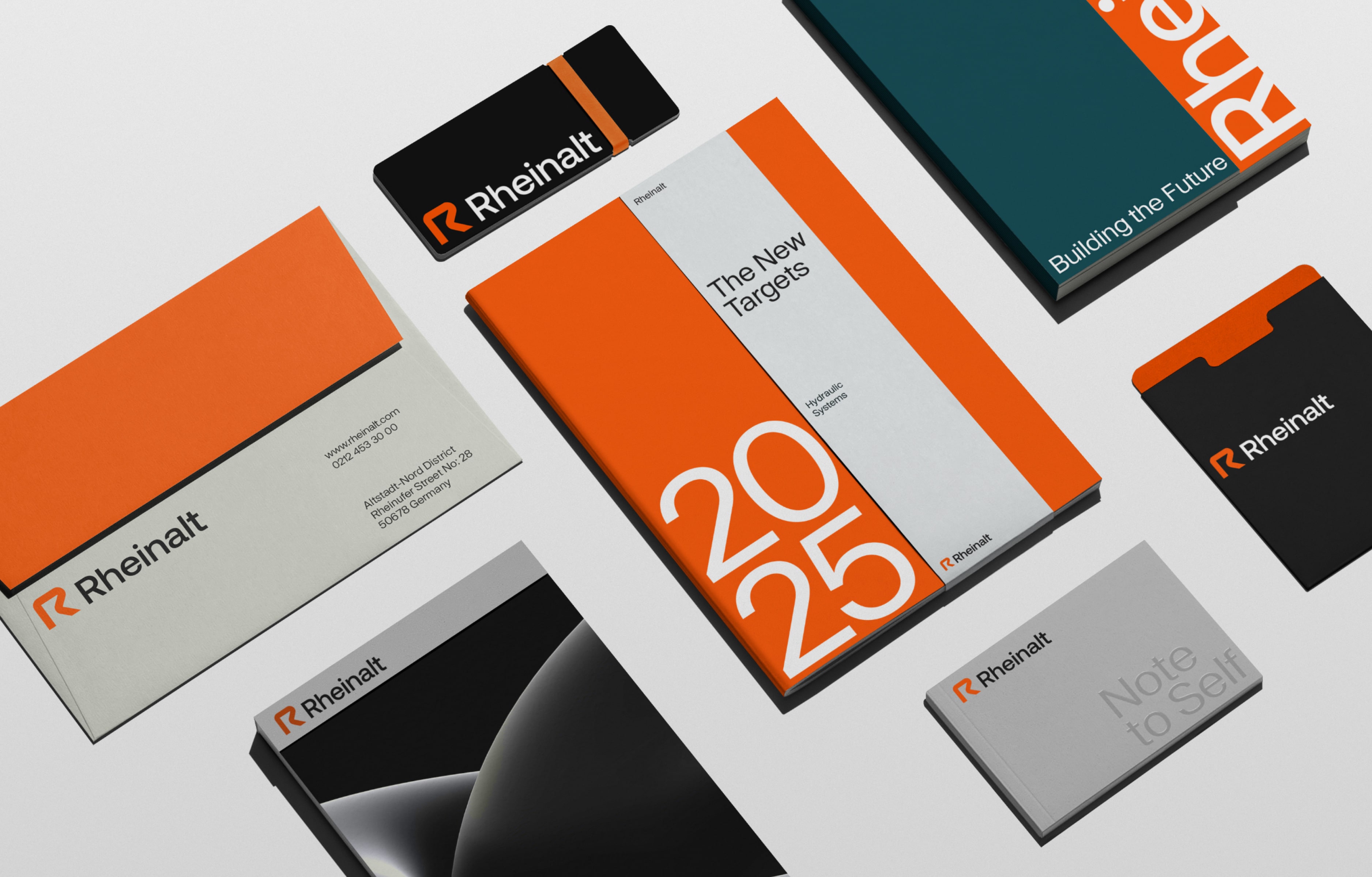
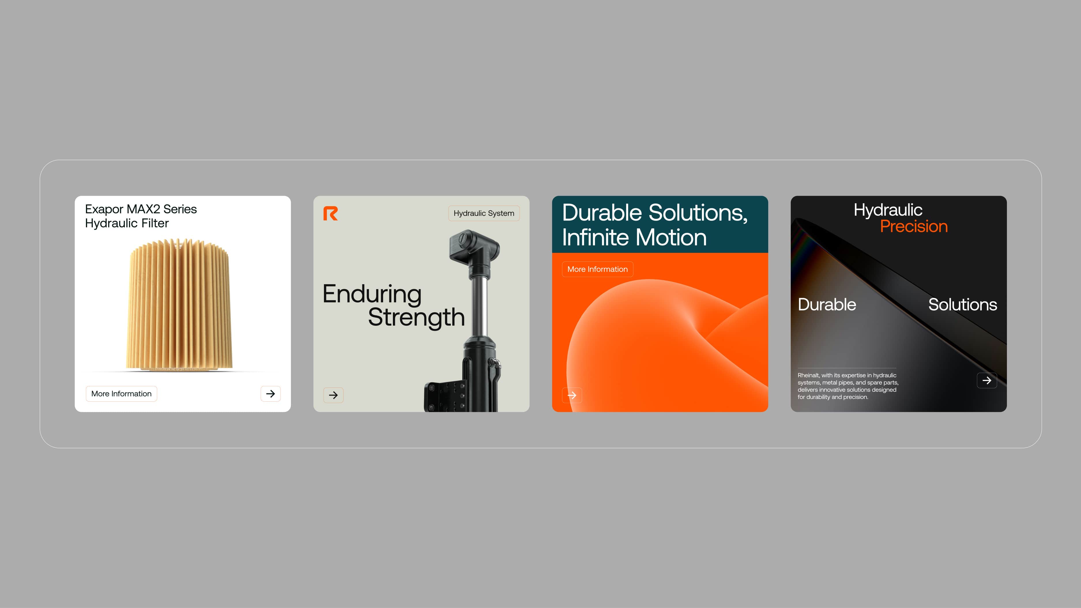
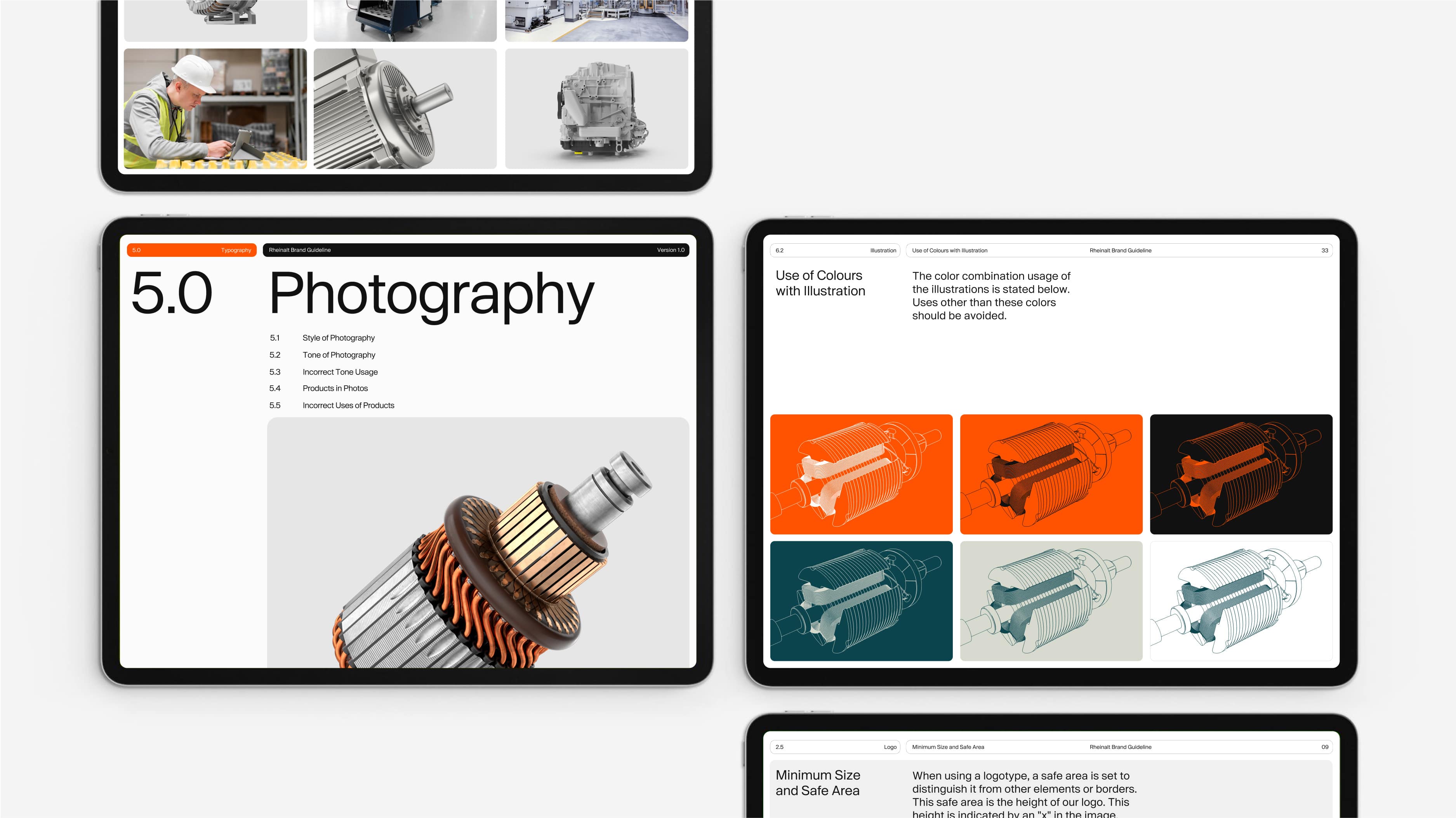
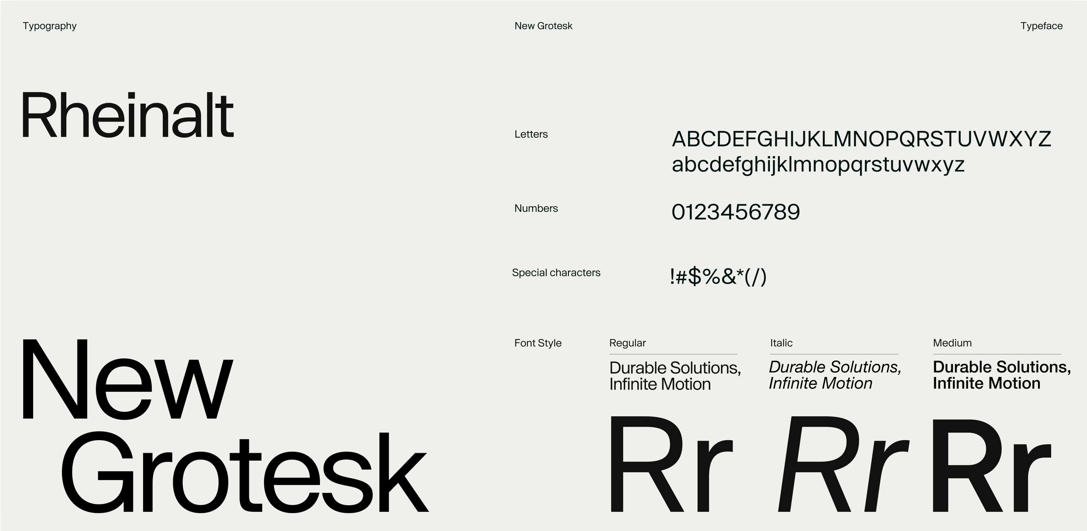
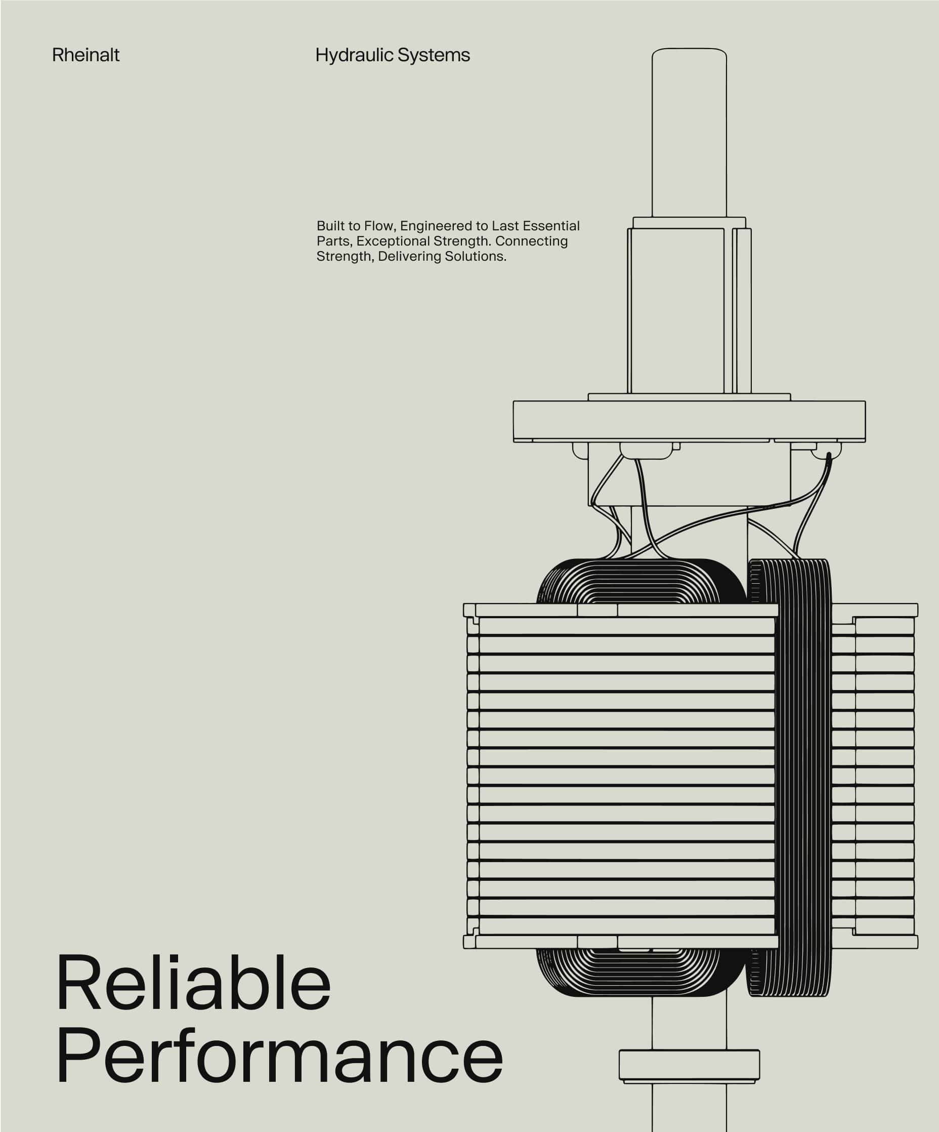
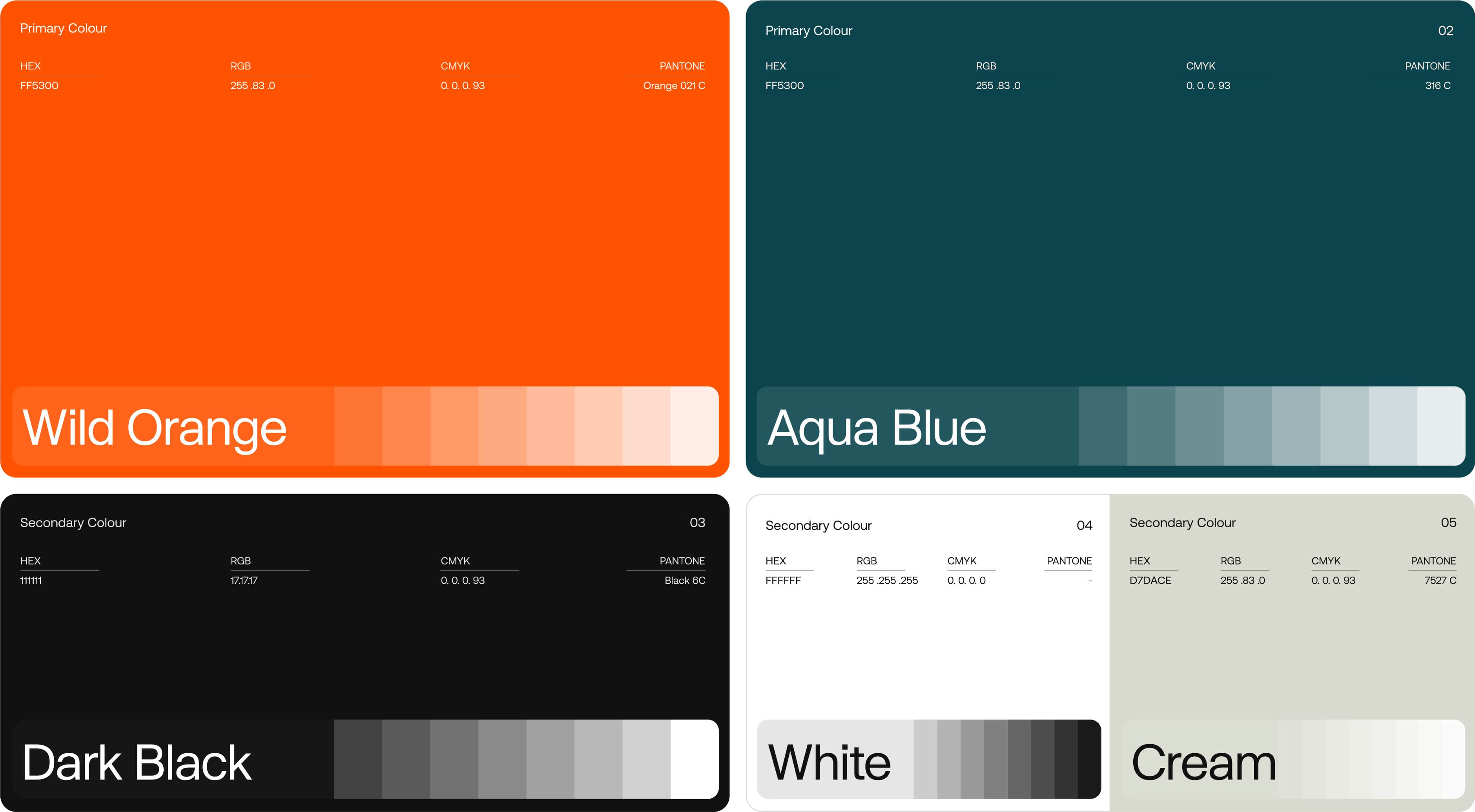
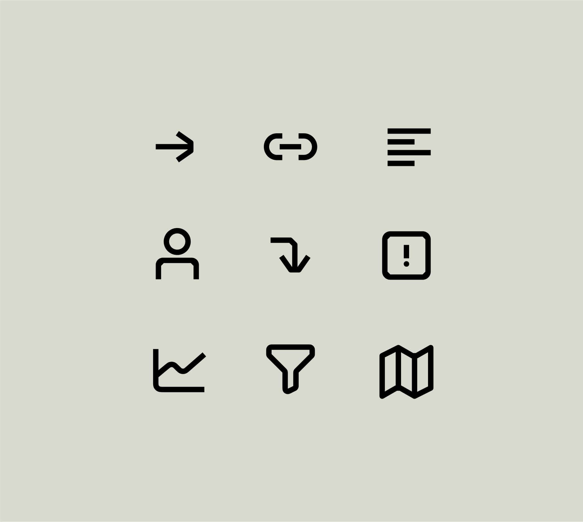
The typographic choices, supported by a vibrant orange, are complemented by a dynamic color palette that adjusts contrast based on content—either boosting it for stronger impact or lowering it for softness and enhanced readability. A modular iconography system further enhances the brand’s clarity and consistency across digital and physical touchpoints.
Through this identity, Rheinalt establishes a confident and reliable presence – laying the groundwork for a durable and distinctive brand experience.